
A FEW EXAMPLES
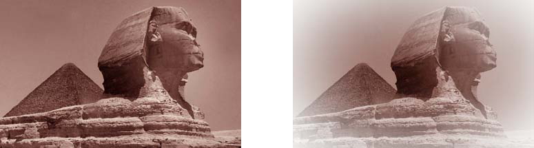
I have taken an image we are all familiar with and corrected it to demonstrate many different looks, which may be asked for in a grading session. I have exaggerated the look in most instances, so it will look good on most home monitors without too much problem. Professional broadcast monitors and projectors, are in fact something I just do not possess in the luxury of my own home.
Most grades initially start by balancing the blacks and whites. Although admittedly the image chosen is lacking any real highlight detail, the thing to remember is that it may have been shot with this particular look in mind - and your enthusiastic correction may just be compromising the intended shot. Communication is key.
The image was picked because I have personally always been in awe of the sculpture; in fact I have been there for several visits. Sometimes creating a different shot from a very basic image is half the challenge, I like to call it 'beautifying.' The other thing to mention is that acquiring permissions from a film production to use images as examples can be quite difficult to do.
Clients
Usually during a grading session the client will be looking for a basic scene-to-scene grade. Balancing the colour and stretching the dynamics to make the blacks black (sometimes they look milky) and the whites white. However the client may want to differentiate the material by employing a particular look, or creating one and changing the 'normal' look. Obviously for soap operas and day to day viewing, this would be unacceptable and probably not within the tight budgetary or time constraints. However drama or smaller projects may use the grading session to really give it punch.
Recently there has been a trend to make things very low contrast, especially within advertising. I personally have to say I am not a fan of this look because it reminds me too much of uncorrected Cineon images, or at least images that have not had the correct LUT applied. Again it is a very personal preference.
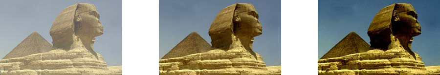
The sphinx has been given three distinct corrections. Low contrast (left), normal or sometimes known as a technical grade
and a high contrast (right). Which is correct? What do you prefer?
There has been an industry realisation over the last decade that colour makes a huge difference to a project. Especially now it is not the black art it once was or that the editorial suites have access to many tools of the colourist. Including many preset styles that a colourist would make from scratch, all at hand with a push of a button, or tick box.
The Look
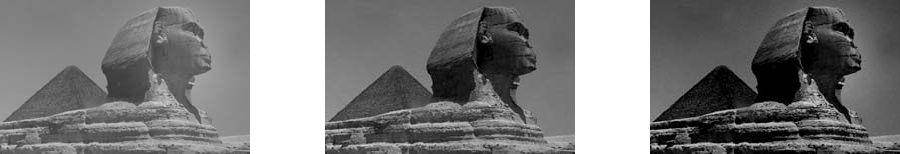
Black & White a basic desaturation of the image; again can vary between a low contrast, 'normal' and high contrast image. To leave some of the detail in the facial features in the high contrast version I included an isolation window over the face to stop too much of the detail from disappearing.
Sepia is an old school look that is reminiscent of old photos that have an aged feeling. A slightly muddied look, which can again be quite subjective - I personally prefer the second example that employs a vignette and washes out the contrast to the edges of the frame.
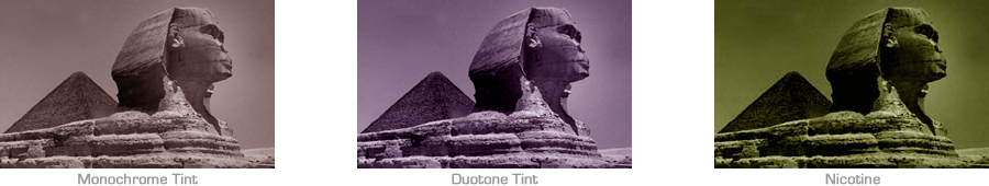
Black & White alternatives - when an images is desaturated we can introduce a colour, sepia is a natural choice due to the familiar colourisation in old film but other looks can be achieved. A monochrome tint is desaturated while pushing the mid tones slightly red, a duo tone pushes two colour's into the image - blue in the lows, reds in the high, which gives the purple tinge.
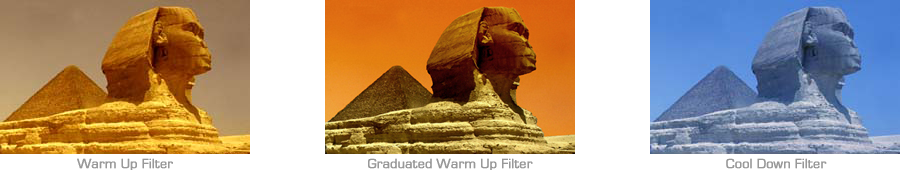
Filter Techniques - colour can be used in many ways to change the image or it can be used to simulate filters that are attached to the lens during principal photography, from changing the density or adding warm up filters it can change the look and feel of the shot. However it is sometimes better to do this in post during the colour correction because often it may be very difficult to reverse the look of a filter or 'in camera' effect if it does not work out. I am very much in favour of doing shots 'in camera' if it is the intended look and will not compromise the project later in production.
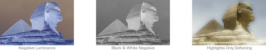
Effects Techniques - there are many effects that can be made to an image, it is just a matter of deciding whether the effect is appropriate or within context of the project. Some can be used for flashbacks, softening the highlights can give a surreal or dreamlike effect. It alos can be used to give a Vaseline type effect for the leading lady, in our case the Sphinx.
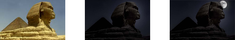
Day for Night - one of the most difficult grading techniques is turning day to night. The sequence is shot during the day and then graded to look like it was shot at night. The reasons for doing this are many but it can be difficult to light a massive area at night to give all of the detail that is required (and expensive). Plus lighting tends to give extreme highlights and other areas too much emphasis taking the viewer away from the action. Shooting during the day will allow the detail to be kept in the foreground, mid and background. How dark to make an image is a skill in itself. How much detail is kept is dependant on the way in which the shots fit together. Once again it is a very subjective grade. The trick is capturing the images with as little contrast as possible. Personally I would recommend an overcast day, otherwise you are fighting heavy shadows that can be difficult to hide without a bright light source, such as a moon?